Case Study:
CyDeploy
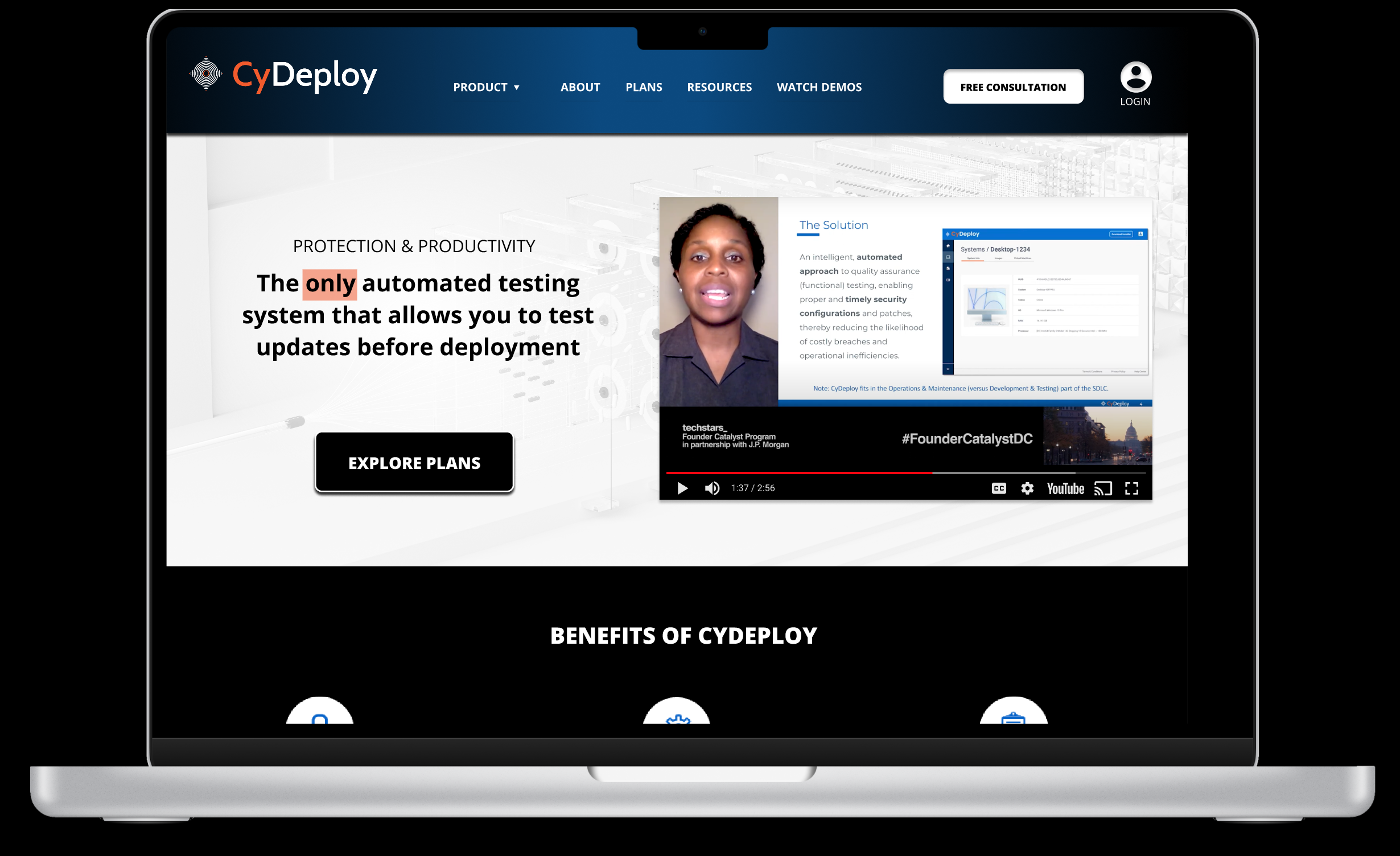
In this case study, we explore my involvement in refining the user experience for CyDeploy, a B2B technology product company specializing in a SaaS solution for secure system changes. CyDeploy’s platform allows organizations to confidently test and implement cybersecurity upgrades, minimizing workflow disruptions and enhancing compliance.
Role:
UX Designer
Tools:
Figma
Slack
Miro
Duration:
March-May 2023
Overview
The project centered on reviewing and enhancing the UX of CyDeploy’s public website, with a focus on improving conversion rates for lead generation. The primary challenge was to better address the needs and concerns of system administrators and IT managers, who are key influencers in the purchase decisions at Managed Service Providers and large enterprises.
Through targeted research with CyDeploy’s core audience, my goal was to develop UX enhancements that not only resonated with these key decision-makers but also supported CyDeploy in articulating a stronger value proposition through its website.
The Situation
Cydeploy has a valuable product that innovates the Cyber security space. But as a startup, Cydeploy is challenged with limited time and resources. They need to generate high-quality leads and content. But users need help grasping the value and benefits of CyDeploy while feeling confident in their ability to use the platform. We need to close this gap through design. Putting the work into developing a website mindful of users saves Cydeploy valuable time and resources, allowing more energy toward continual development of the product.
Business challenges
Generating high-quality leads, producing captivating content, effectively reaching the target audience, and dealing with limited resources.
VS
User Challenges
Grasping the value of CyDeploy and its benefits within their existing systems, while also fostering confidence in their capability to successfully implement and utilize the solution.
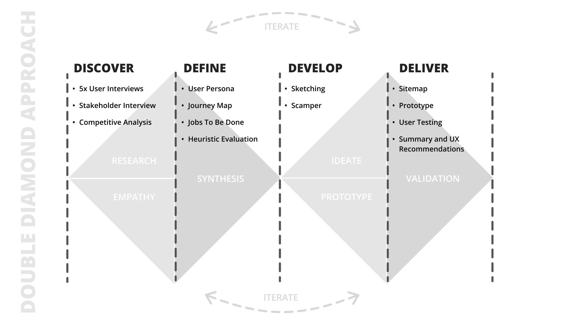
I followed a human-cetnred design approach to investigate and deliver insights on how to match CyDeploy’s business needs and the user needs.
Project Objectives
- Conduct user research to understand target audience needs and preferences
- Review and recommend UX enhancements for CyDeploy website
- Identify areas for conversion improvement and lead generation
- Empower system administrators to promote CyDeploy
Research
My research began with the stakeholder interview where I learned more about the needs of the business. Then to learn more about the user I conducted user interviews. In order to get an idea of how other’s were approaching problems in the market, I conducted a competitive analysis.
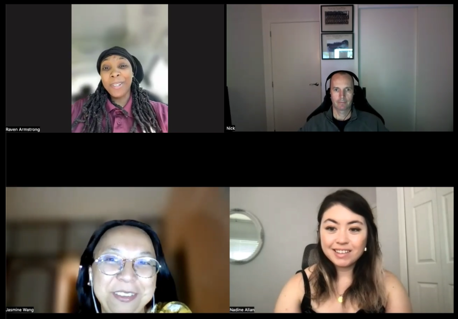
Five 1:1 user interviews were conducted with the target audience.
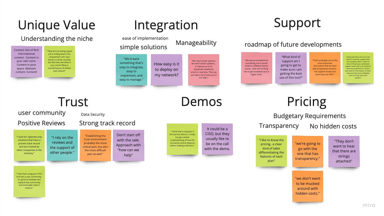
I used affinity mapping to synthesize the main themes. Pictured here, I grouped direct quotes from interviews to create a few main areas of importance
“How easy is it to deploy on my network?” or “What kind of support am I getting?”. By documenting and combining these in the process, we better address them with our design so users have their basic questions answered before reaching out.
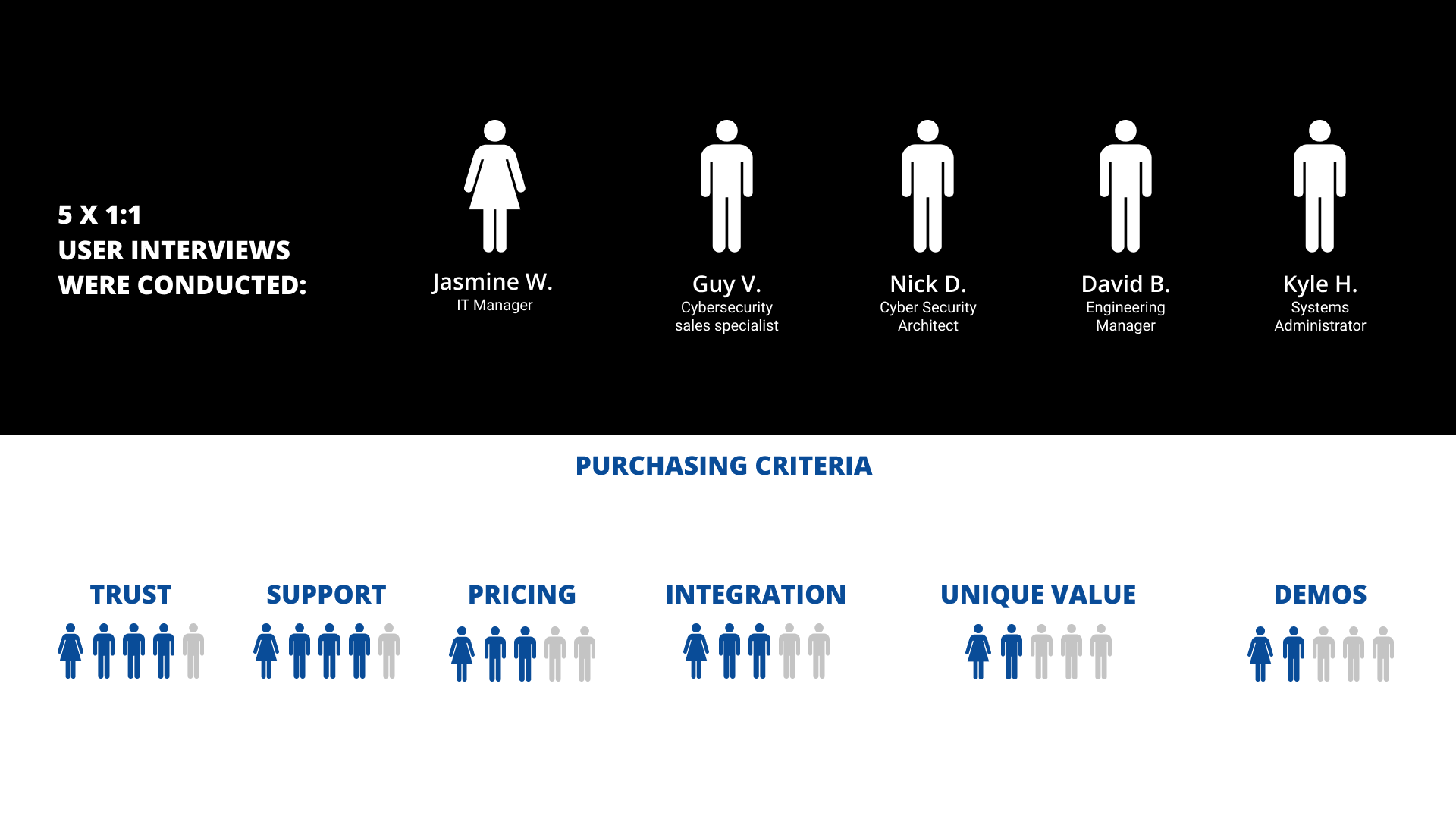
I also gathered data on the users’ main purchasing criteria:
4 out of 5 subjects mentioned Trust or support as an important aspect in making their purchasing decision. Users need to be shown endorsements, in the form of testimonials in order to be comfortable in the value of CyDeploy, and feel they will be taken care of after signup.
3 out of 5 subjects mentioned pricing or integration. Users are cost-sensitive, and also want to understand how the product fits with their current tools.
Finally, 2 out of 5 subjects mentioned unique value or Demos. Now, I do believe these two have a high importance, as “how to empower system administrators to promote CyDeploy” is a core question in the brief.
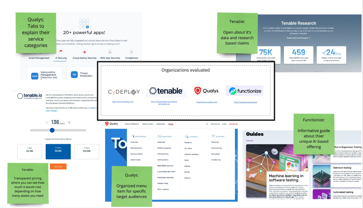
Competitive anyalysis:
- I then conducted a competitive analysis with the goal of identifying how other top competitors in the cybersecurity industry address our user concerns.
- For example, adjustable pricing, information broken down into tabs, helpful guides and proof of support – all these methods help address our common user concerns.
Defining the data
Next, we synthesize our data to create insights to help us close the gap between business and user needs.
Based on the user interviews, I created a persona that synthesized the characteristics, behaviors and needs of our target users into the form of “Anna”
So here’s Anna: she is a security operations manager at a medium-sized org in the education sector. She has lots of responsibilities, and so choosing the right cybersecurity solutions is a big deal.
One notable consideration about Anna is that her eyes are very sensitive and wears special blue light blocking glasses due to the long hours she spends on the screen. Furthermore, she has early stages of age-related macular degeneration which are causing color contrast issues.
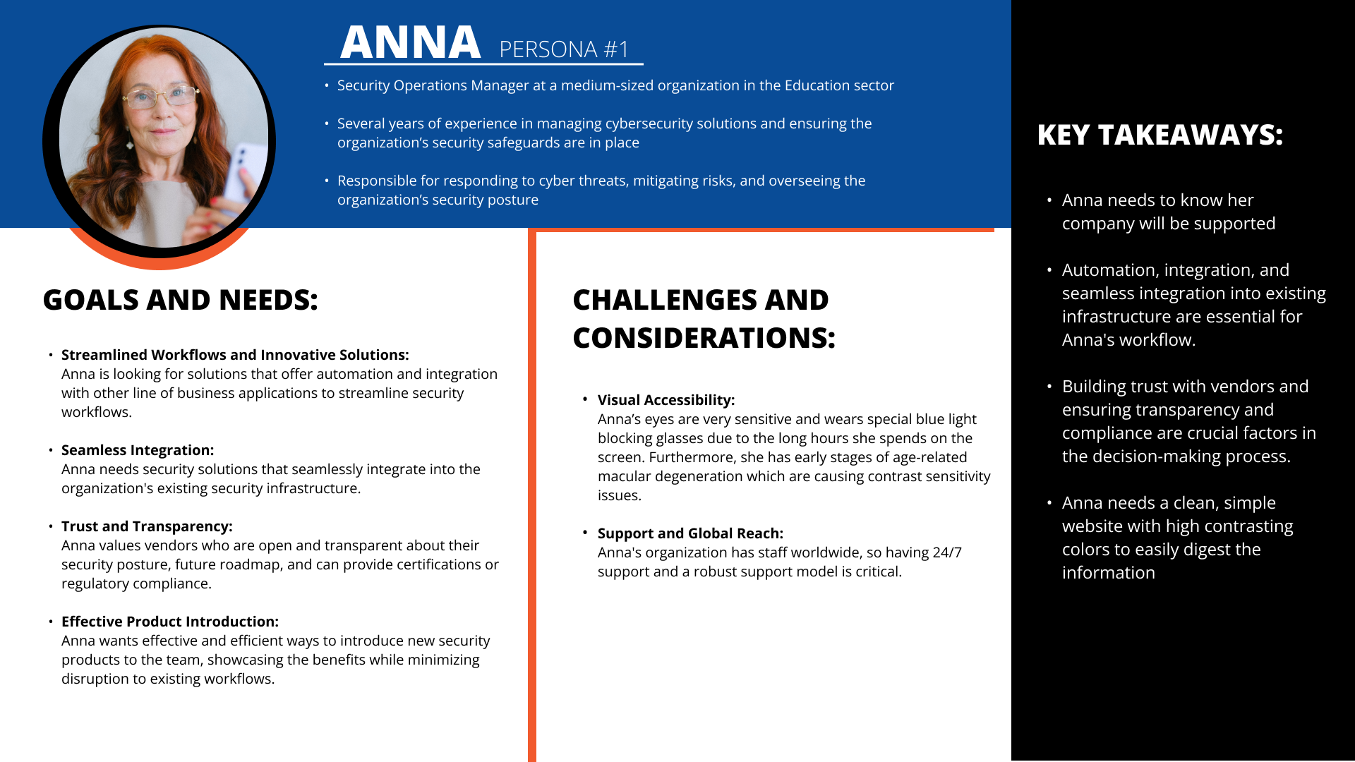
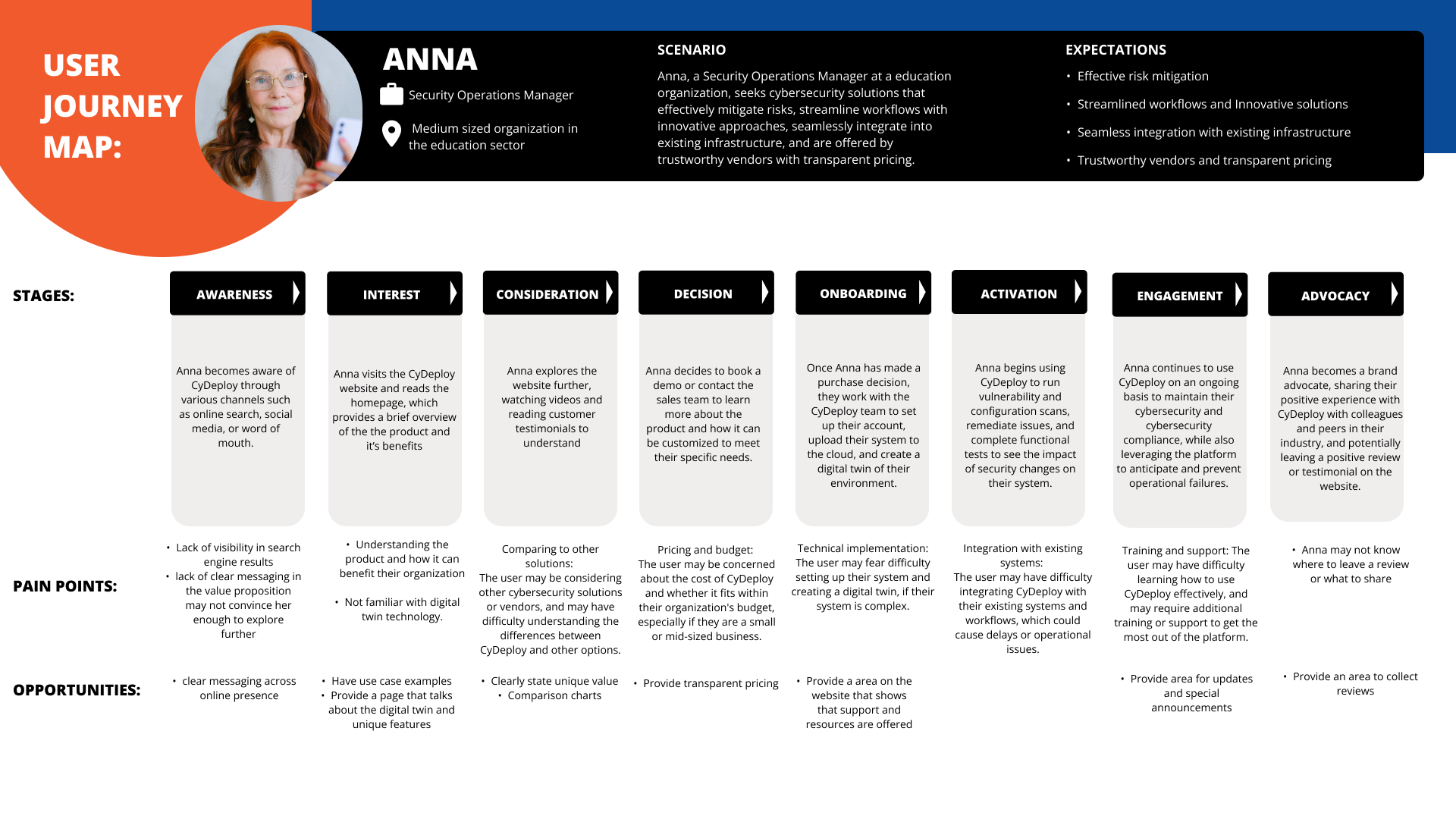
With Anna in mind, I created a user journey map. This identifies the obstacles, frustrations, and pain points that our users encounter when interacting with CyDeploy.
I enjoyed this process. It helps you consider the big picture, beyond just the user interactions on the website. Anna’s journey begins as far back as her initial awareness of CyDeploy, and continues long after using it, and deciding if she wants to become an advocate and recommend it to others.
Overall, CyDeploy can address pain points through improved messaging across all these steps, including technical support, and user training. This increases the likelihood of conversion and retention.
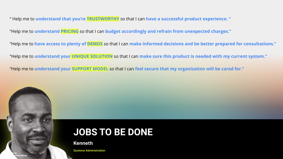
Based on the user interviews, I identified the key “jobs” users are trying to get done when deciding to use CyDeploy. Jobs to be done highlights several key themes that are crucial for CyDeploy’s customers when considering cybersecurity solutions, including the need for comprehensive demos, transparent pricing, reliable support, trustworthy solutions, and unique features. By prioritizing these themes in our UX enhancement recommendations, we believe CyDeploy can better meet it’s customers’ needs and preferences and ultimately improve conversion rates.
Accessibility
Another consideration while working on the implementation of designs is accessibility.
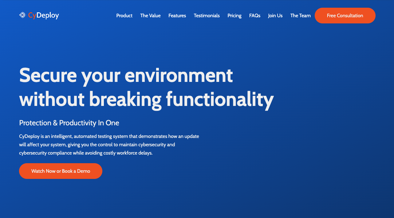
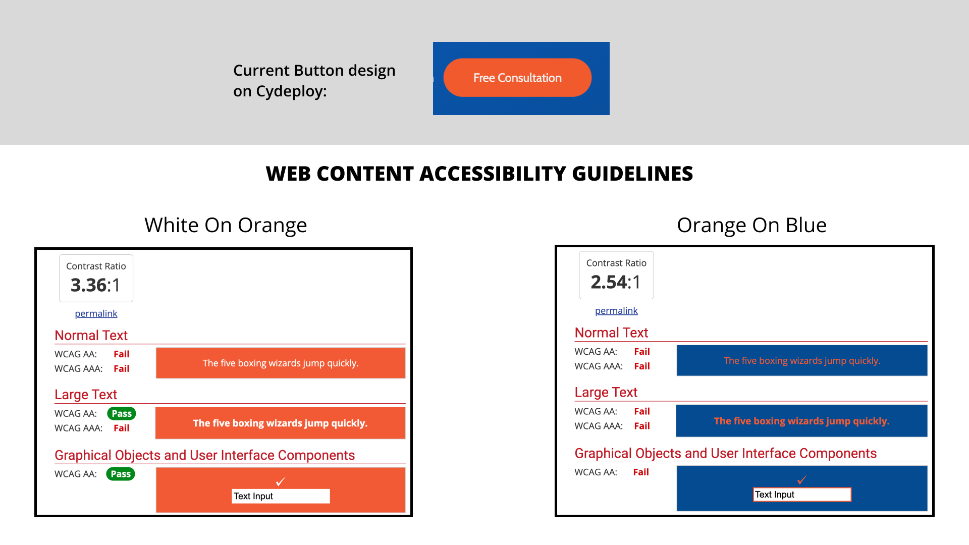
I tested the current CyDeploy button color scheme against the Web Content accessibility Guidlines.
The WCAG contrast measures the difference in brightness (luminance) between two colours. It ranges from 1:1 (white on white) to 21:1 (black on white). For accessibility, the higher the left hand number the better. WCAG requires a contrast ratio of at least 4.5:1 for normal text.
Notice how I put the warm grey background on the slide. This color combination is very luminous and needed a neutral color to ground it and be visually digestible. I suggest adding black and shades of gray to the Cydeploy palate.
This is important especially for all interactive areas of the website like buttons.
In the case of our user persona, Anna, she might have difficulty finding what she needs within the current design, due to her visual impairments.
Develop
The next step is crafting a solution for both business and user needs. For example, transparent pricing was very important for users. However, in conversations with Tina, she stated it’s challenging to give a concrete number for the site, as pricing is determined by unique business needs.
Creating an adjustable pricing table that users can input their details to see an estimate right away may be a viable solution in this case.
On this step, I also focused on arranging the content to place lead generation drivers in areas that were more consumable by users.
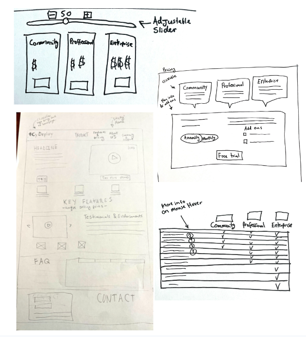
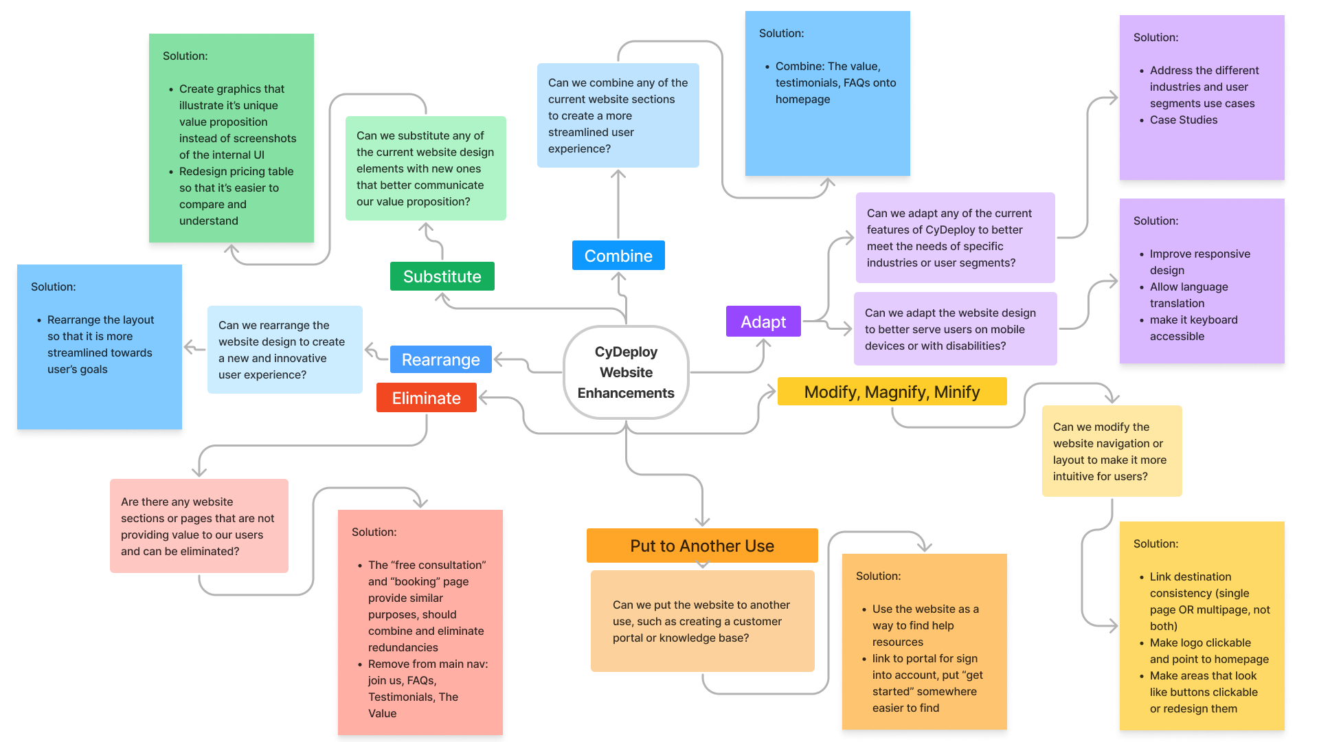
Doing a SCAMPER exercise helps us discover new ways to make the current site more efficient. There are a number of valuable takeaways on this slide, but I’ll only cover a couple: A link to the internal portal for customer accounts should be placed in the top navigation bar. The “free consultation” and “booking” pages share a similar purpose and should be combined to focus the funnel.
Site Map
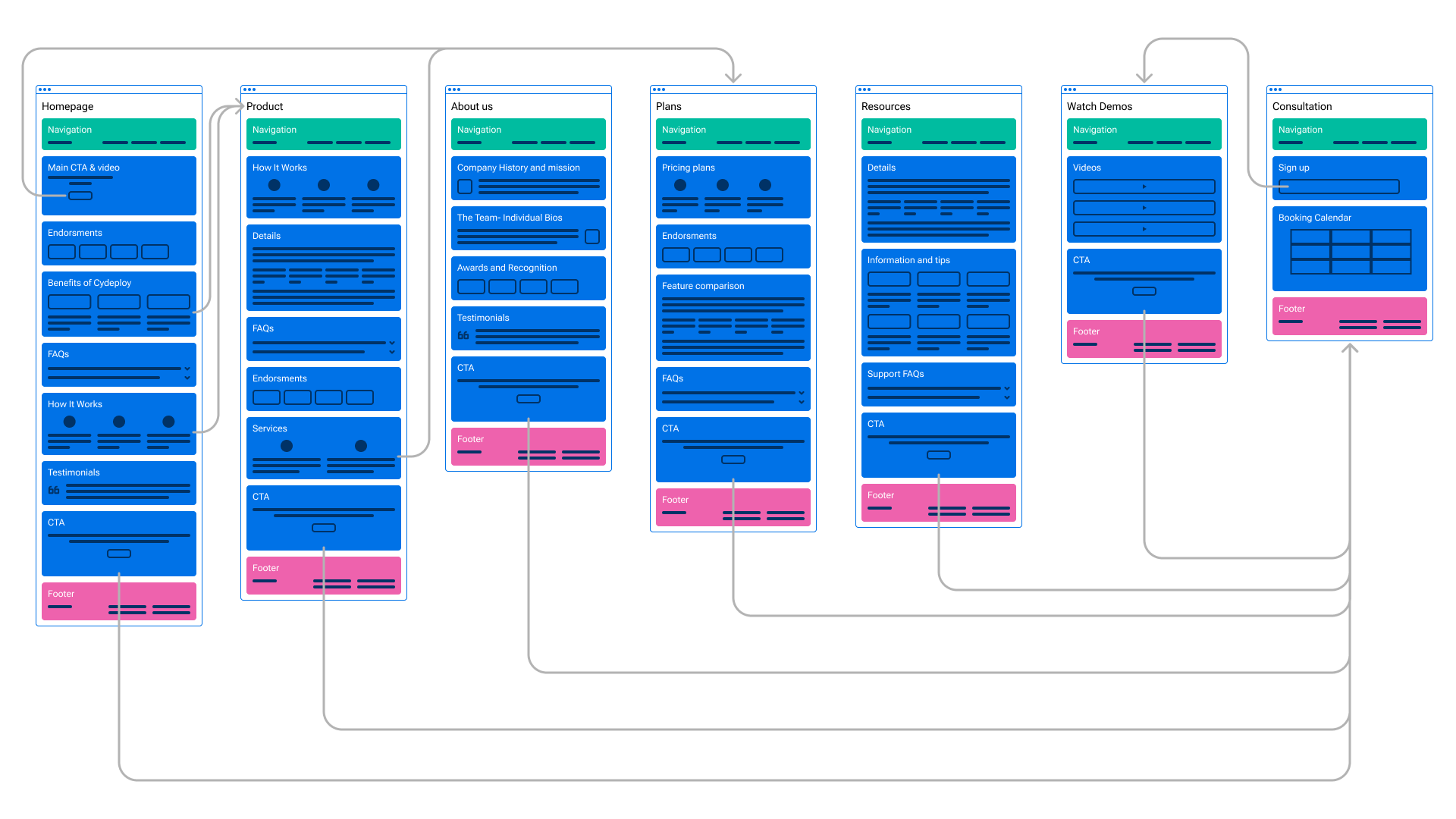
Since Cydeploy’s current website’s main lead generation outlet seems to be the “free consultation”, I want to focus on directing users there in the layout. Also, as our user research suggested its importance, we will sprinkle throughout the sitemap reminders and endorsements to build “trust”.
User Testing
Next I created a basic mockup to test avenues that users would gravitate to for lead generation.
I used this design to validate and conduct user testing to gather valuable feedback and refine the user experience: By involving real users in the testing process, we can gain insights into how well our design solutions meet their needs, identify any usability issues or areas for improvement, and make necessary refinements to enhance the user experience before the final implementation.
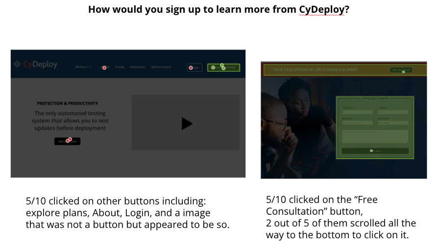
I asked our users “How would you sign up to learn more from the company?”.
5/10 clicked on other buttons: explore plans, About, Login, and an image that was not a button but appeared to be so.
While 5/10 clicked on the “Free Consultation” button, 2 scrolled all the way to the bottom of the page to do it..
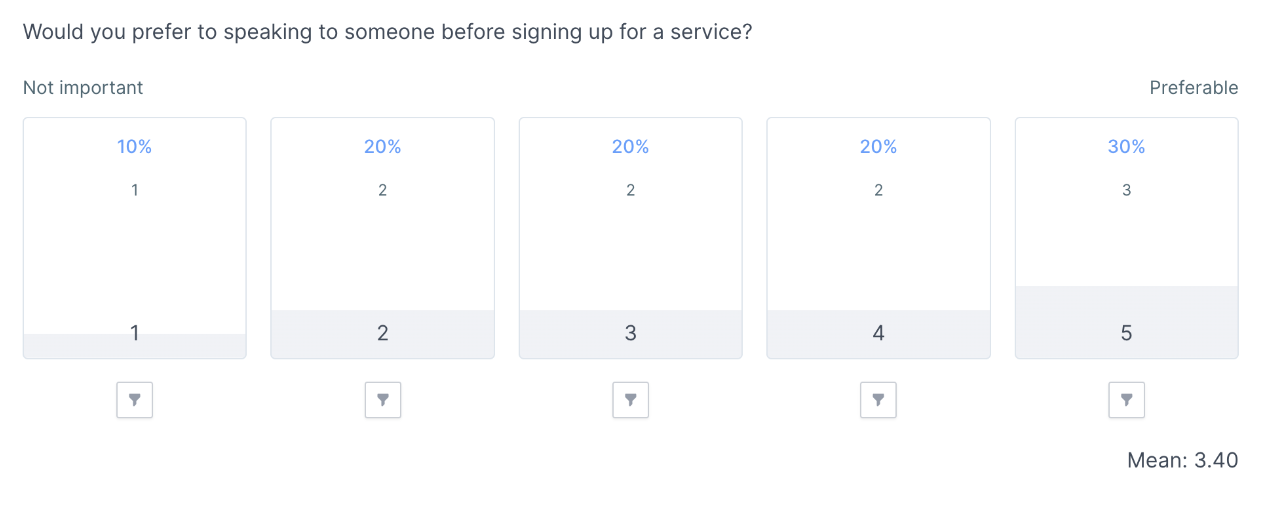
As the Cydeploy website’s focus for lead generation is the “free consultation”, I surveyed the target audience on the importance of speaking to someone before purchasing. The results showed an evenly spread opinion, showing no real preference.
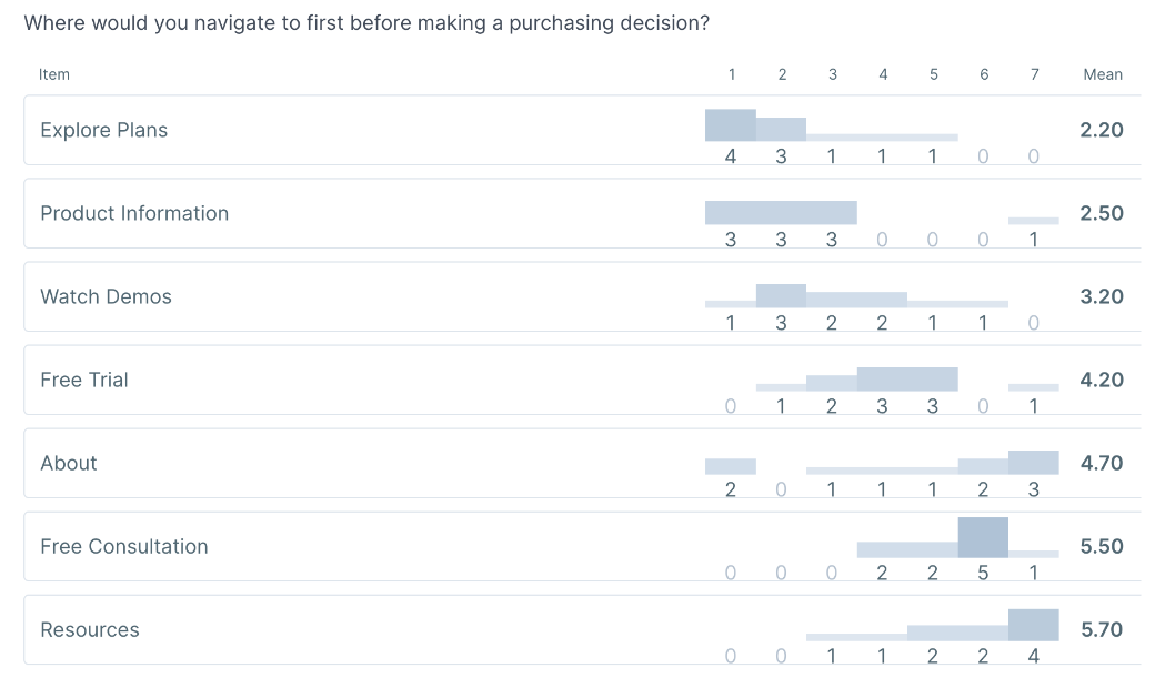
Users the ranked where they would go first when making a purchasing decision. On this chart, one is most important and seven is least important.
In order of importance, users would first navigate to “explore plans,” while “resources” is the least likely..
Final Designs
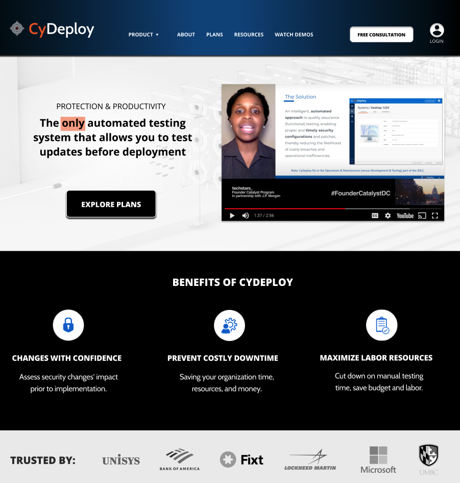
Learning from the user testing, I created more high fidelity designs.
Key takeaways from user testing:
- Changed “login” button to a clickable logo to reduce visual confusion
- User’s have different behaviors on the site, so we want to repeat placement of the lead generation avenues: Free Consultation, Plans, and About
- It is good to place the most important info as the first element users see on the homepage. This means demonstration of CyDeploys unique value.

Lo-fi Prototype
Other Recommendations:
- Mobile friendly responsive site
- Branding:
- consistent across platforms
- Provide multiple touchpoints:
- Consider the avenues in which user’s will reach the site, and avenues for collecting testimonials, recommendations etc.
- Video
- More consistency in the video style and make them more concise
TAKEAWAYS
OUTCOME:
My designs were chosen by the stakeholders to implement in the website redesign.
LEARNINGS:
It is vital as a UX Designer to keep an open mind and learn about new areas in order to do good work. In the case of CyDeploy, it was a steep learning curve to get familiar with Cyber Security lingo and subject matter.
Nadine Allan
Feel free to reach out!
